Graphic design is one of those skills that everyone should have a basic understanding of. There are many nuances to graphic design, but what does the average professional person need to know about the craft? Here are some of the basics of good design that every person should know.
What are the best graphic design tips for non-designers?
The following four tips can be summed up into one sentence: make your content engaging for your audience. Good graphic design draws the gaze of your audience, is easy to read, and has a cohesive design. The following tips will help your designs engage your audience.
Are you looking for some graphic design tips for non-designers? Check out a few design element tips to help spice up your social media pages and graphics here! #DesignSquid Click To Tweet- White Space is Your Friend
- Pick a Color Scheme for Your Design
- Stay with Easy to Read Font Families
- Pay Attention to Alignment
1) White Space is Your Friend
White space (also known as negative space) is often overlooked by new designers, but this is a mistake. You need the white space so that your text and graphics will stand out and draw the eye.
If you have a wall of text on your project, readers will glance right over it because it takes longer than two seconds to read. This is why when designing any piece of content (including blog posts) the designer needs to break up the text. The takeaway here is don’t overfill your design.
2) Pick a Color Scheme for Your Design
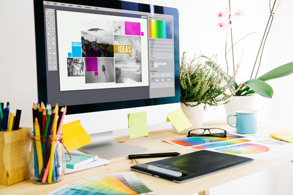
Color schemes have an important role to play in graphic design. It is the first thing people notice about a piece. A good color palette can have only one base color in different shades, or it can have many different colors.
It all depends on where the colors line up on the color wheel. Colors on the opposite side of the color wheel are good contrasting colors. If you want more than two colors, try dividing the color wheel up into thirds.
3) Stay with Easy to Read Fonts
As tempting as it can be to pick that loopy cursive font, you need to make sure your audience can read your graphic. Pick a font that is clear whether it is bolded, italicized, or spaced out. Your design should have a maximum of two fonts. Any more than that is going to overcomplicate the piece and make it more difficult to engage with.
Choosing fonts can be tricky, but a great rule of thumb is to pick a font family like Helvetica, Arial, Times New Roman, Lato, or Veranda. There are many more out there. Just look around for something easy to read without being too stiff.
4) Pay Attention to Alignment
When you are designing any piece of content, you need to look out for the alignment of your elements. When things are not aligned, it makes the design difficult to read. Never eyeball the alignment of your project.
Most Importantly: Have Fun
The most important graphic design tip for non-designers is this: have fun with it. Whatever you are designing should be something you enjoy because that will show in your work. Graphic design is fun as well as important.
Designs Are Our Specialty
Design Squid loves design so much we put it in our name. Have more questions about graphic design? Contact us for more tips and tricks!


